Crafting a compelling brand identity for Inware presents a unique and multifaceted challenge.
Industry
IT Hardware & Electronics Distribution (New and Reconditioned Equipment)
Scope
Full Brand Identity Design – including logo, visual direction, brand positioning, and market differentiation strategy
Duration
3–4 weeks (from initial briefing to final delivery)
Stage
Completed – Final identity approved and delivered for implementation across platforms


Introduction
The CEO of Inware, Mr. Hicham—who, coincidentally, is the cousin of one of my former clients—reached out with a request to develop a brand identity inspired by the one I created for Maydan Tech. We recently held our initial Zoom meeting to explore the project in greater detail and align on the creative direction.
Challenge
The main challenge in designing Inware’s brand identity is to create a visual language that balances innovation with trust. As a company specializing in both new and reconditioned IT hardware, Inware aims to elevate the image of reconditioned products by offering them with the reliability of new ones. The branding must reflect this promise of quality and dependability.
Operating in a competitive market with players like PC GEANT and TERA, Inware also needs to stand out. The identity should emphasize its exclusive European toner line and convey a sense of professionalism and modernity, while staying approachable for a varied audience—including students, schools, SMEs, and local institutions.
Approach
The project began with a clear understanding of Inware’s mission: delivering high-quality reconditioned IT hardware and exclusive European toner at competitive prices.
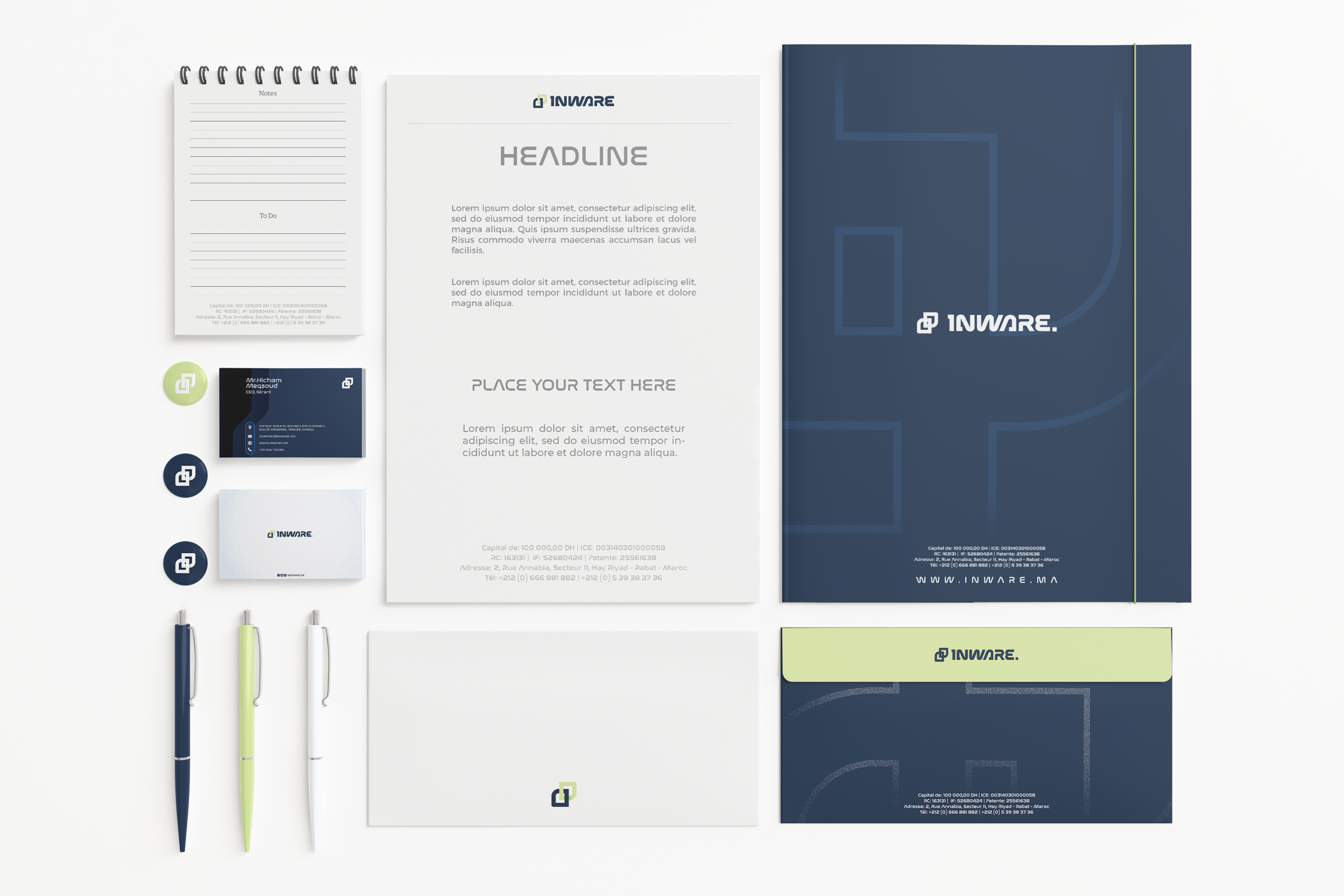
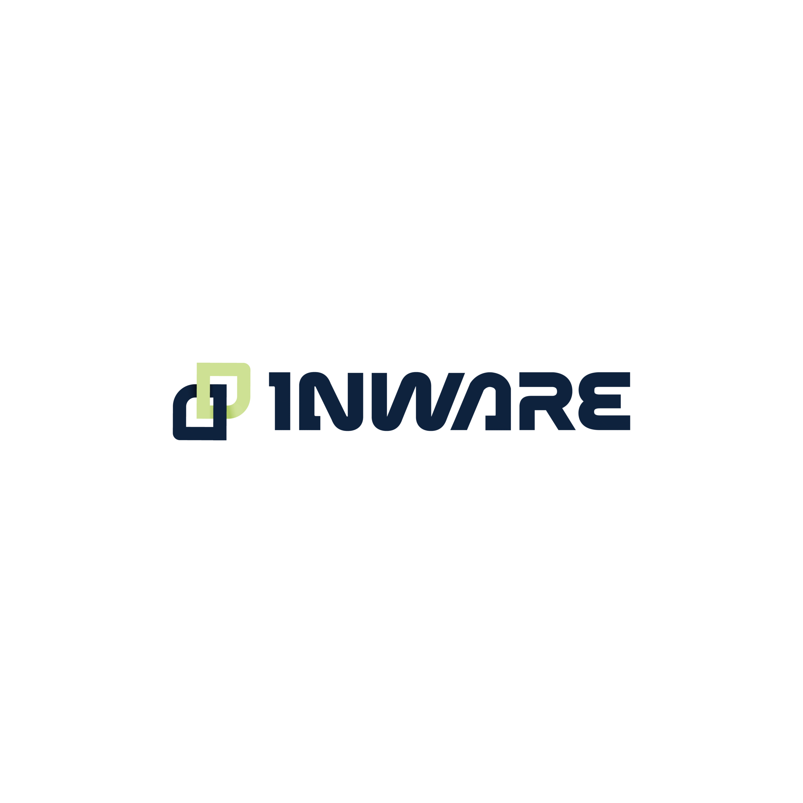
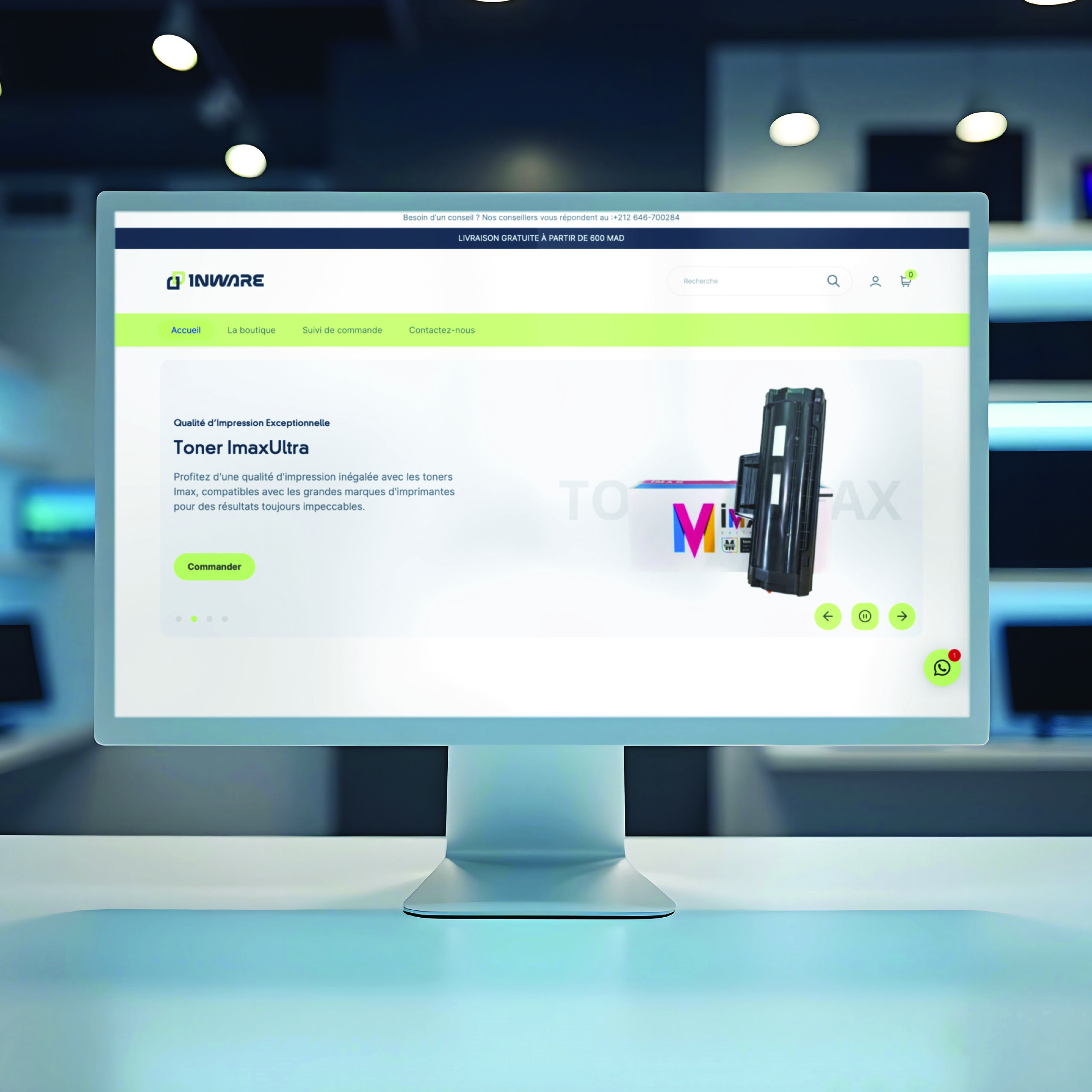
We analyzed the market and target audience to differentiate Inware from competitors like PC GEANT and TERA. The final logo combines bold typography for trust and strength, an interlocking symbol for innovation and connection, and a green accent to reflect sustainability.
Drawing inspiration from the Maydan Tech project, the identity was refined in close collaboration with the client to ensure it was modern, distinct, and adaptable.
The Goal
The goal is to communicate high quality at competitive prices, positioning Inware as a credible, forward-looking brand in the tech distribution space.
- Brand Strategy Development
- Competitive Analysis
- Visual Identity Design
- Typography & Color Theory
- Client Communication & Collaboration
- Creative Direction
- Market-Audience Alignment