Redesign and Format Adaptation of Rose Water Label for Enhanced Visual Appeal and Size Variations.
Industry
Consumer Goods / Beauty & Wellness
Scope
Packaging Design & Brand Adaptation
Duration
2 weeks
Stage
Product Refinement / Market Launch
Introduction
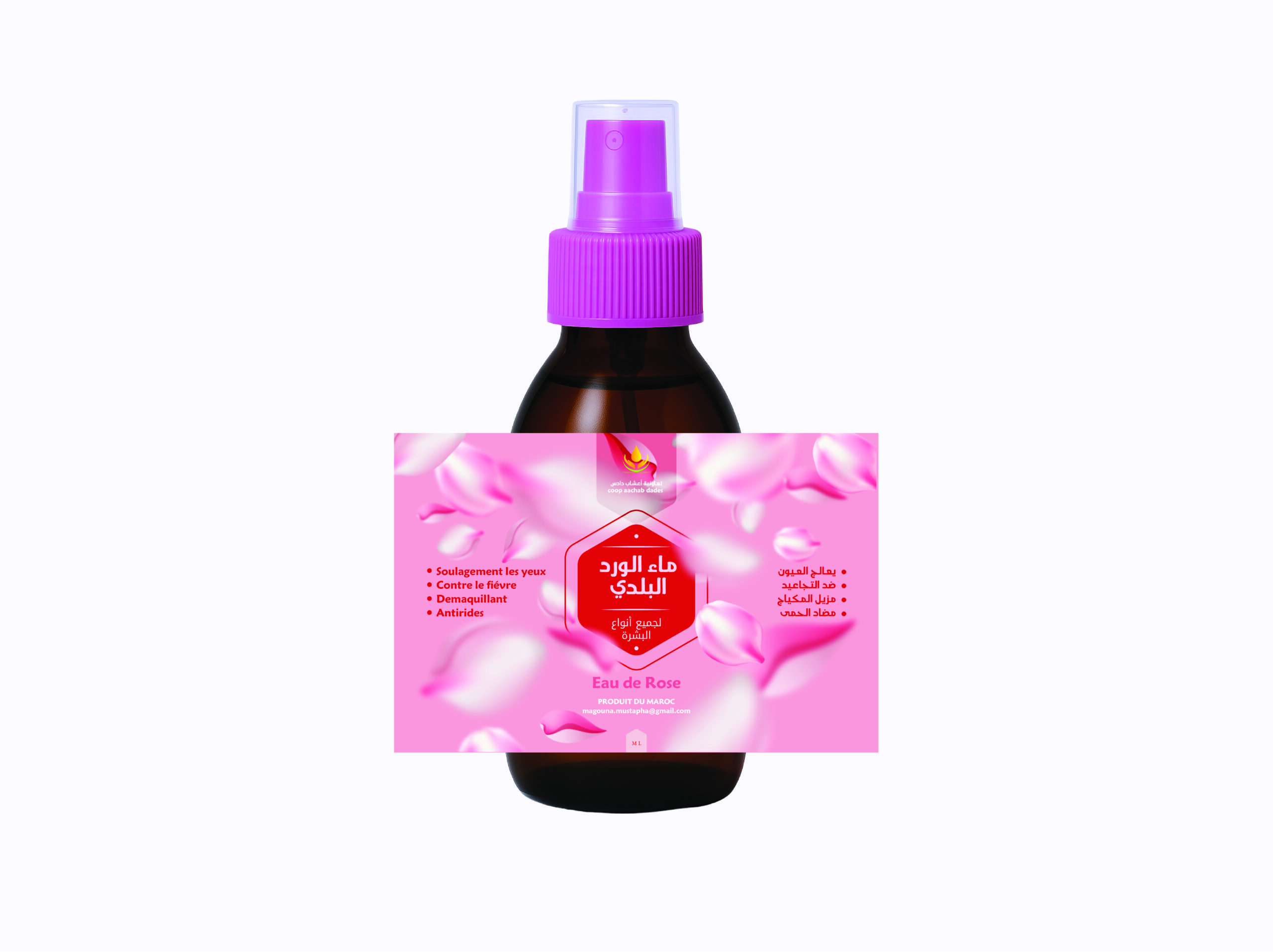
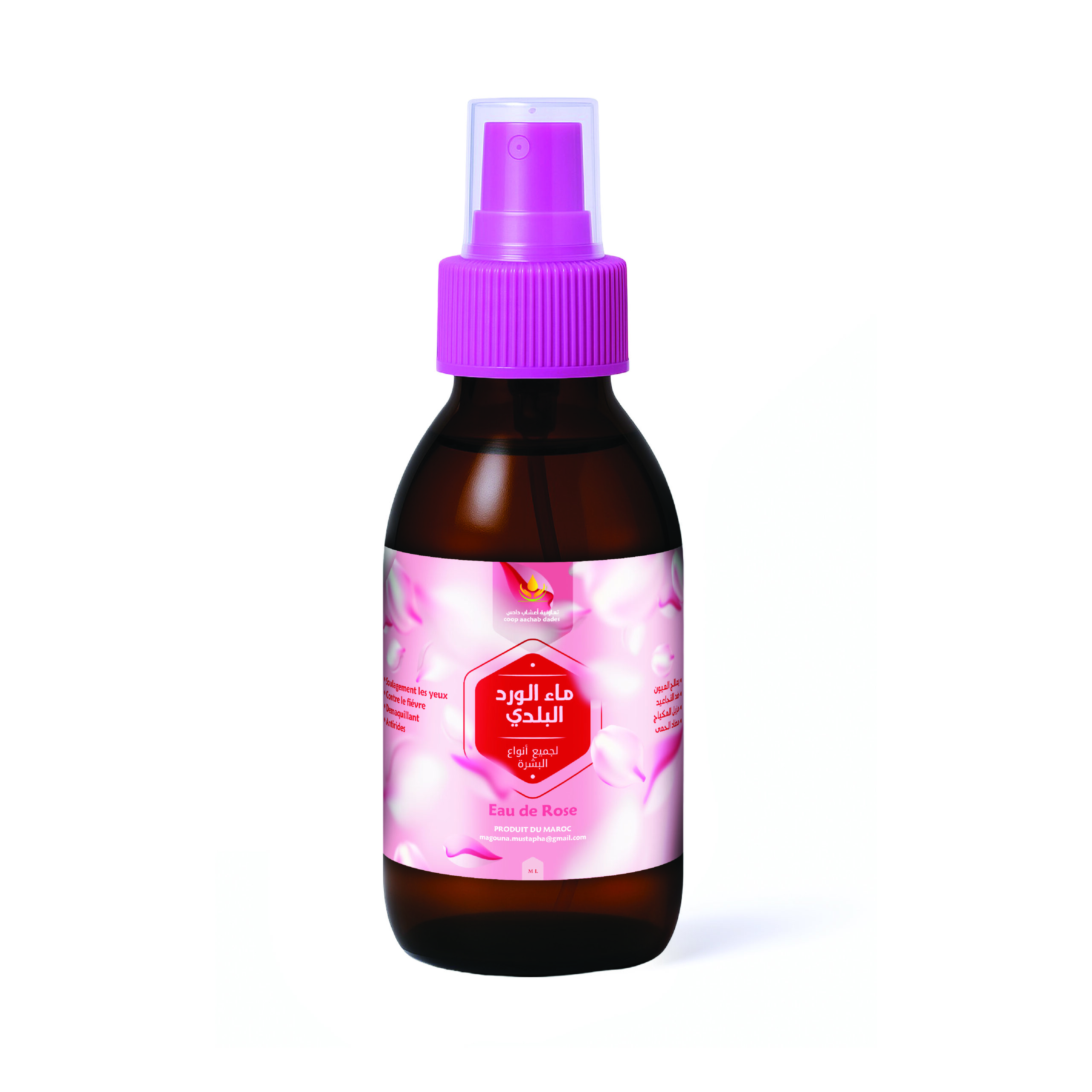
This project involved a complete redesign of the rose water label to enhance visual appeal, reflect the brand identity, and ensure consistency across various packaging formats. The aim was to create a clean, modern aesthetic that remains versatile and eye-catching across multiple display environments.
Challenge
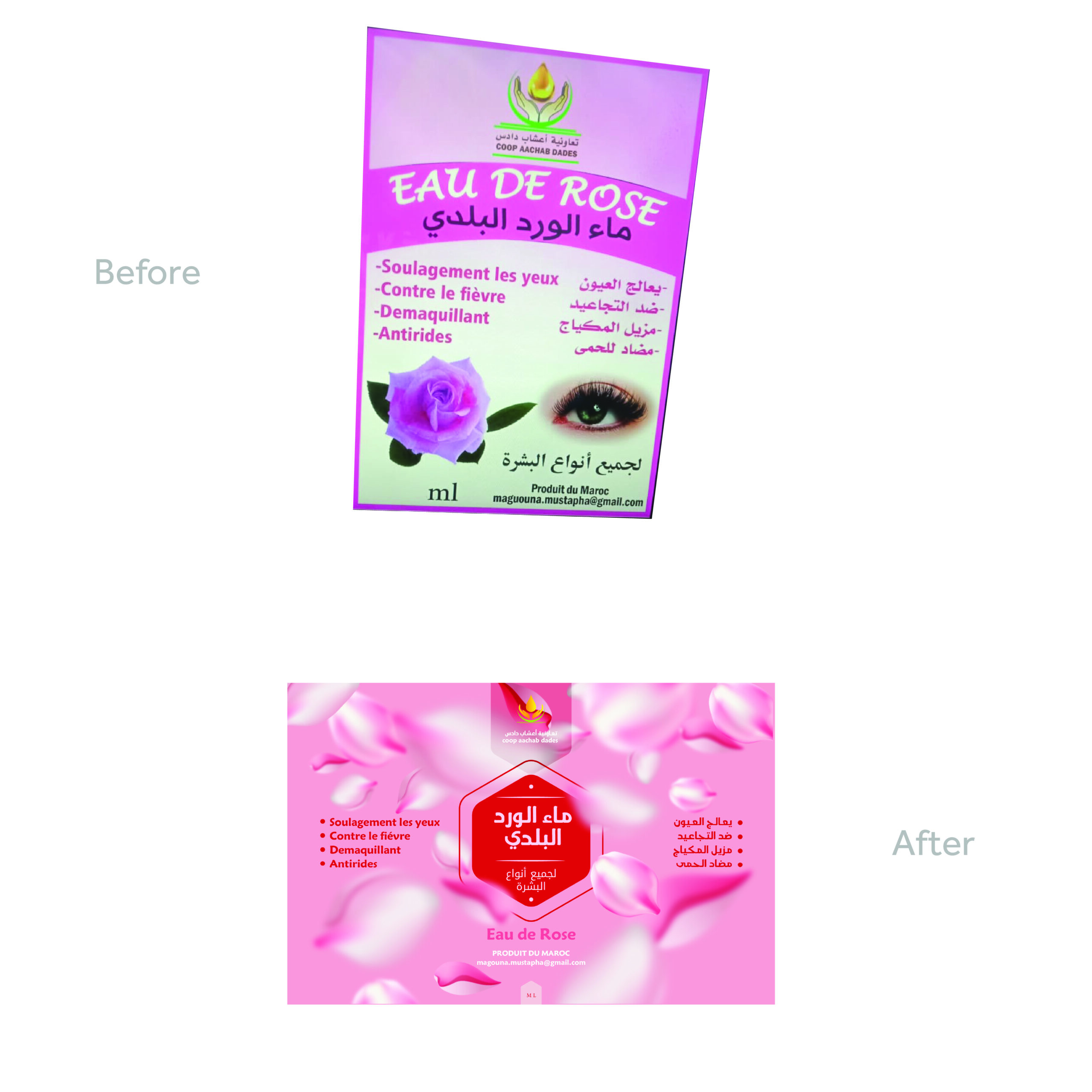
The original label lacked consistency in layout and did not translate well across different container sizes. Additionally, it failed to fully capture the product’s natural and luxurious qualities, limiting its appeal to the target market.
Approach
My strategy combined a refined design language with scalable layout systems to suit various packaging sizes. We introduced updated typography, an improved color palette, and high-resolution floral illustrations to evoke purity and elegance. The new label design maintains brand recognition while elevating product presence on shelves.
Skills involved
- Design System Development
- Brand Strategy
- Design system
- Strategy
- Value Proposition Refinement
- Lead Generation Planning